When Colour Could Kill: Stories From the History of Paint
Delve into paint’s storied past — what you learn about its history and modern incarnations may surprise you.

I credit Victoria Finlay for the contents of this article. She is the author of “Colour – A Natural History of the Palette”. She lives near Bath, England, and is writing a second book on colour for the Getty Museum. Her research has led her around the world and deep into the history of colour — and the risks we’ve taken to bring the most beautiful hues into our homes.
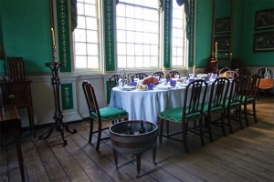
“[I am ] sorry to find that the Green paint which was got to give the dining room another coat should have turned out so bad,” wrote the 45-year-old George Washington from the battlefield in 1787. The summons to the farmer-turned-soldier to take up the role of commander in chief of the continental army had come at a rather inconvenient time for the decoration at his house at Mount Vernon, and he wrote home frequently, requesting updates on every aspect of the work, including the long-running saga of the green to be used in the large dining room.
George Washington’s paint in question was verdigris, a pigment made by suspending copper over a bath of vinegar; it was very fashionable in both Europe and America at the end of the 18th century. Looking at its restoration (with hand-ground paints) at Mount Vernon, Virginia, today it still seems so exotic — one can see why the future president obsessed about it. But he and his craftsmen had not done their chemical homework, to miserable effect.
If Washington or his works manager, Lund Washington, had had access to the 15th-century classic The Craftsman’s Handbook by the artist Cennino Cennini, they would have discovered that, according to the book:
A colour known as verdigris is green. It is very green by itself. And it is manufactured by alchemy, from copper and vinegar. This colour is good on panel, tempered with size. Take care never to get it near any white lead, for they are mortal enemies in every respect. Work it up with vinegar, which it retains in accordance with its nature. And if you wish to make a most perfect green for grass … it is beautiful to the eye, but it does not last.
But Lund put lead white on the finishes, and within a few months, the bright turquoise had darkened and needed to be replaced – although it was finished again in time for G.W. and his family to be in that room in 1789 when they learned he was to be the first president of the United States.
Notorious green
The paint that later became notorious for being toxic was discovered almost accidentally in Sweden in 1775 by a scientist called Carl Wilhelm Scheele. It was a bright and almost shocking shade, reminiscent of deep emerald. He called it Scheele’s Green, and from the beginning it was a sensation. Parents particularly loved it for their children’s bedrooms, as it was so much brighter than the dull grays and browns they were used to, but it was also used for artificial flowers, carpets and clothes, and it stayed in fashion for a century.
Yet this colour was a killer: children and invalids died from sleeping in their green rooms; a Persian cat locked in an emerald bedroom was discovered covered in pustules; Napoleon died rather mysteriously on St. Helena Island in a green bedroom, and it was only in the 1980s that anyone was able to do an analysis on his hair. It had traces of one of the key ingredients of Scheele’s green: arsenic.

Why England’s post boxes are red
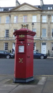
The colour of England’s pillar post boxes, which we now take for granted, was a matter of deep consternation when the post office started using them (rather than doing home collections) in the 19th century. The first boxes were green, until people complained that they were always bumping into them, so in the early 1880s they were repainted an eye-catching red silicate enamel. The enamel did not last, and in many places faded hopelessly to a pinky white within a few months.
The trouble was, for years there was no paint available that was bright and yet could withstand the competing challenges of sunshine and frost. In the post office archives there are several letters from members of the public complaining about the colour. One person suggested they paint them gray like battleships, which at least would have had the merit of staying colour consistent – because surely people knew by then where their local post boxes were to be found.
Colour becomes consistent
As part of her research, she went to deepest Dorset, England to visit the headquarters of Farrow and Ball, which was founded in the 1980s when the English National Trust needed an expert to mix paints for its great houses in need of redecoration.

Today Farrow & Ball paints, with terrific names like Clunch, (from old slang for a chalk building block), Blackened, (referring to when soot was used to make an off-white pigment with a silver tint), String, Ball Down Pipe, and Dead Salmon appeal to people wanting the colours in their living rooms to be just like the ones in British stately homes and then sometimes, just a tad more eccentric.
Before she went, she had a romantic image of the people at Farrow & Ball using many of the same pigments and ingredients that a 19th-century painter would have used, but that is not the case. First of all, 19th-century painters had to assemble and prepare the paint ingredients for themselves (as a young Irish immigrant noticed when he arrived in Brooklyn in the late 1870s. He decided there must be an easier way. His name was Benjamin Moore.)

Second, as Farrow & Ball’s managing director, Tom Helme, pointed out, the quality of these very fugitive 19th-century paints would not have been good enough for our modern-day demands. “Nowadays people want the colour on their walls to stay constant. In the past people knew it would change quickly, and they were resigned to it.”
And third, as she discovered in her journey, many of the old paint colours are now illegal. These include lead white, which was banned in the U.S. in 1977 but which is still used in many countries – and just a few years ago activists in Calcutta, India, were protesting that deities thrown symbolically into the river Ganges during processions should not be painted, as the lead paint is poisoning the holy river.

We can, of course, be nostalgic for a past where the colours of our paints were made from real things: rocks, plants, galls, precious minerals, soot and sometimes (in the case of carmine) little round bugs. But then we can be grateful too: today’s synthetic colours will not poison us. They will also probably not mix with other paints and have dramatic and sometimes lethal chemical reactions. And, unlike with George Washington’s much-wanted, though quickly fading, large green dining room, we can be fairly confident that once the colour is on the wall, it will remain more-or-less constant until we make the considered decision to paint over it and try something new.
There are many, many more stories about the origins of paint colours – each one a fascinating discovery of something we today, take for granted. So, enjoy your painted walls, and perhaps next time we might look at how you can find your own colour and how to use it in your home.

