10 Tips to Help to Get Your Furniture Arrangement Right
 Here are 10 basic layout rules to help you create a polished, pulled-together look in any room
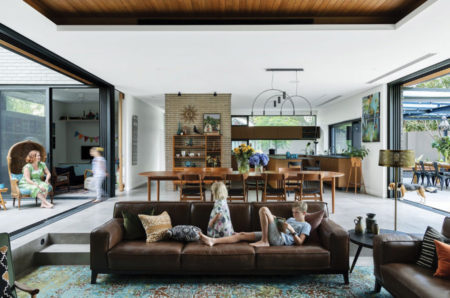 Like a blank page or canvas, an empty room can be either an opportunity or a challenge. With so many ways to fill it, how do you know where to start?
Here are some of the basic rules of furniture arrangement that have been distilled into 10 simple tips. They’ll help you or your interior designer to determine where to put things, where not to put things and how to prioritize the choices you make.
Step 1. Think About How the Room Will Function
Consider how the room is used and how many people will use it during the day. Many of us have homes with a great room that includes not only the entry and living area but the kitchen and dining areas too, so there are many activities take place here.
As well as reading and relaxing, you may use it for entertaining small or large scale gatherings, for the kids’ homework or crafts and as a home office. These uses will help determine the type of furnishings you’ll need and the amount of seating required.
 Step 2. Decide on a Focal Point
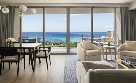
The large open-plan space can include different focal points but the main one will be for the living area. This is your principal space.
Identify the room’s focal point, the view, television, fabulous art or a feature wall—and orient the furniture accordingly. If you plan to watch television in the room, the ideal distance between the set and the seating is three times the size of the screen (measured diagonally). Therefore, if you’ve got a 40-inch set, your chair should be 120 inches away.
Step 3. Start with Priority Pieces
Place the largest pieces of furniture first, such as the sofa in the living room or the bed in the bedroom. In most cases this piece will face the room’s focal point. Seating should be no more than 8 feet apart to facilitate conversation and unless your room is especially small, avoid pushing all the furniture against the walls. Leave space for the room to ‘breathe’.
 Step 4. Consider Symmetry
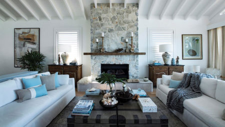
Symmetrical arrangements work best for formal rooms. They offer a sense of order and try this if:
You have a focal point centered in the room such as a fireplace, French doors, or a built-in unit.
You are a more logical and like order and structure.
You don’t want to put a lot of thought into your furniture arrangement but still want balance.
You are seeking a more serious aesthetic.
However, asymmetrical arrangements are more versatile and make a room feel more casual. Try an asymmetrical arrangement if:
- You thrive in organized chaos.
- You love spending time arranging furniture to find unique ways of achieving balance.
- You are seeking a more playful space.
- You want to create a more casual setting.
 Step 5. Create a Traffic Flow
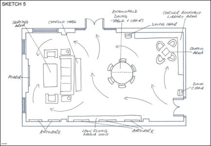
Think about the flow of traffic through the room—generally the path between two doorways. Don’t block that path with any large pieces of furniture if you can avoid it. Allow 30 to 48 inches of width for major traffic routes and a minimum of 24 inches of width for minor ones.
Try to direct traffic around a seating group, not through the middle of it. If traffic cuts through the middle of the room, consider creating two small seating areas instead of one large one.
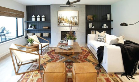 Step 6. Aim for Variety
Vary the size of furniture pieces throughout the room, encourage the eye to move up and down as you scan the space. Balance a large or tall item by placing another piece of similar height across the room from it (or use art to replicate the scale). Avoid putting two tall pieces next to each other.
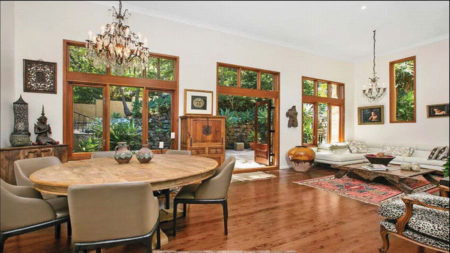 Step 7. Build in Contrast—Mix it up!
Combine straight and curved lines for contrast. If larger furniture is linear, throw in a round table for contrast. If the furniture is curvy, mix in an angular piece. Similarly, pair solids with voids: Combine a leggy chair with a solid side table, and a solid chair with a leggy table.
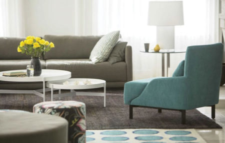 Step 8. Design for Ease of Use
Place a table within easy reach of every seat, being sure to combine pieces of similar scale, and make sure every reading chair has light accessible from a nearby lamp. Coffee tables should be located 14” to 18” from a sofa to provide sufficient legroom and the height should be in relation to the height of the sofa seat.
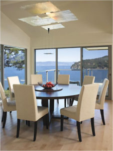 Step 9. Allow for Circulation
In the dining area, make sure there’s at least 48” between each edge of the table and the nearest wall or piece of furniture. If traffic doesn’t pass behind the chairs on one side of the table, 36” should be fine.
In bedrooms, allow at least 24” between the side of the bed and a wall or other furniture, and at least 36” between the bed and a swinging door.
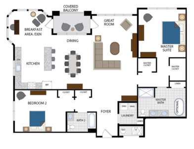 Step 10. Do Your Planning
Give your back a break. Before you move any furniture, test your design on paper. Measure the room’s dimensions, noting the location of windows, doors, and electrical outlets, then draw up a floor plan on graph paper using cut-outs to represent the furnishings. Or, better yet, use a digital room planner to draw the space and test various furniture configurations. It’s less work and a lot more fun.
Now you have it all planned out, take the opportunity to transform your blank canvas into a beautiful work of art for you to sit back and enjoy!
Until next time…
Shelagh
Royal Palm Interiors – Uvita – 2743-8323
royalpalminteriors.com
Like us on facebook.com/RoyalPalmInteriors


